Cernit Polymer Clay Gold and Copper Blends

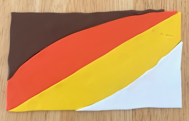
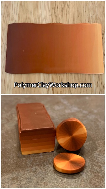
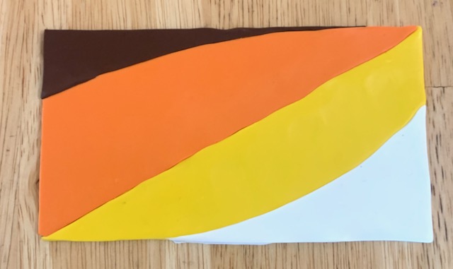
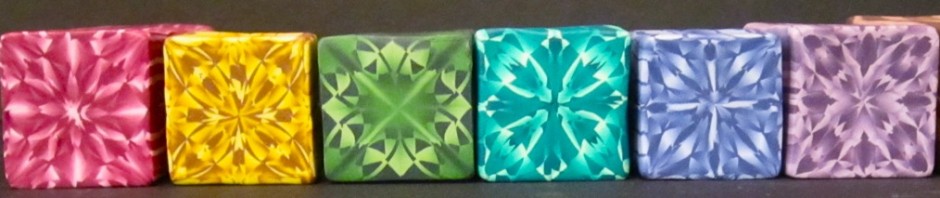
I’m excited to be adding to my new Cernit color blend directory! Many of you know that metallics effects are my favorite. The “copper” and “gold” are very similar. In my opinion “poppy red” in Cernit looks more like dark orange, but the extra red in it makes in look more copper to me when it goes in the blend. Here is the printable stencil. Be sure to adjust it to the width of your pasta machine.

This entry was posted in Uncategorized. Bookmark the permalink.

Leave a Reply

Fill in your details below or click an icon to log in:

WordPress.com Logo

You are commenting using your WordPress.com account. Log Out /  Change )

Twitter picture

You are commenting using your Twitter account. Log Out /  Change )

Facebook photo

You are commenting using your Facebook account. Log Out /  Change )

Connecting to %s